Why and how color is a powerful symbol
Have you ever considered that color is symbolic?
You probably have not considered how powerful color is. You know different colors affect you emotionally, psychologically, and physiologically. But perhaps you do not know how color is vital to communication.
- Have you explored why you choose the clothing colors you do? Why do you wear that red suit or black dress or orange hat for particular events? Why you choose a specific paint color for your dining room?
- Why are sales tags red or orange?
- Why do fast-food restaurants use yellows and reds in marketing — while fine dining restaurants use browns and creams and gold to decorate?
Have you ever delayed a purchase of a cell phone or car or home appliance because the retailer did not have the color you wanted? You know, the object or product works the same no matter the color — but you waited until the store had that silver or pink or blue. And that sounds crazy. But it’s not. Research confirms people make subconscious judgments about a person, an environment, or a product within ninety seconds of seeing it — and that 62% to 90% of that judgment is based on color!
Awareness of color’s impact on our lives is empowering. The knowledge can add to your nonverbal communication acuity. You can improve your marketing. Or your personal style. By taking those unconscious judgments into our conscious thought process, we can alter both what we communicate and how we understand others.
SEEING COLORS
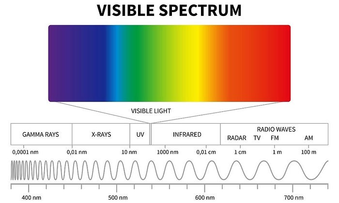
One and one-half percent of the electromagnetic spectrum is visible light. At least for humans. Many animals, like spiders, bees, and rats, see more than visible light. Maybe that’s not such a big deal, because color doesn’t exist.
What?
That’s right. Color is our brain’s subjective interpretation of the waves hitting our eyes. Each “color” has a wavelength and frequency, so we perceive differences. While I don’t want to turn this article into a physics lecture, I want you to appreciate the science behind the magic. Technically, our eyes (the cones of the retina) only perceive red, yellow, and blue. It’s our brains that interpret combinations to see green or gold or orange.
Yes, it’s all in your head.
My interest in color perception started with a dress, which you might remember. Blogger Caitlin’s dress became a viral topic of discussion when some people saw a white and gold dress and others saw a blue and black dress. Although most people saw a white dress with gold stripes, the dress is a blue dress with black stripes. The illusion resulted from how the brain processes the daylight.
Another popular color internet sensation is Christian Kesniel’s watch the green shirt illusion. Christian produced five versions of him, in different colored hoodies, performing the same dance. The clip instructs you to keep your eye on the Christian wearing a green hoodie positioned at the front of a group. When the group shuffles positions, the green hoodie still appears to be at the front of the group. Once you check out the original video, take the time to observe how Christian gradually changed all the hoodie colors cause our brains to see the effect.
Color is magical, fantastical, and an illusion.
COLOR COMMUNICATES
The emotional impact colors have on us is directly related to nature. We see reds, oranges, and yellows as warm — like a sunny day or a desert. We see greens, blues, and purples as cool — like the ocean or evening tones. But temperature is not the only association. Our brains, specifically the pineal gland, the pituitary gland, and the hypothalamus, release chemicals based upon the quality of light — and let us know the time of day, that we should rise or sleep, for example. And our bodies react to color: blue light cures liver dysfunction (jaundice, for example) and cool colors can reduce blood pressure.
According to several theories, including the color-in-context theory, our perception of color is vital to survival. A lush, green woods or blue water indicates available food. While blue food (only blueberries which are more purple) indicates mold and inedibility. The color red is associated with danger and demands attention because it is the color of blood and fire.
You also cannot deny the strong emotional impact of color. It’s evident in our language:
- She’s feeling blue.
- The doctor says she’s in the pink and all better!
- Everything is so dull and grey today.
Theorists surmise the wavelength of light (color) may cause emotional reactions: longer wavelengths attract the eye faster and are, therefore, stimulating. That’s why yellow gets your attention. Short wavelength light (color) are soothing and lower blood pressure, respiration, and pulse. Blue is serene, for example, and has been used to create calm environments:
- In 2000, Glasgow installed blue street lighting, which resulted in a reduction in certain violent crime in the area.
- Japan installed blue lighting in railroad stations to reduce suicide attempts.
Advertising and marketing experts are aware of physiological, psychological and emotional color associations. Even with the most cursory understanding of color impact, you can appreciate how color is used to persuade, motivate, and capture attention.
Fast-food restaurants use red, yellow, and orange to both capture attention and invite quick response. These hot colors stimulate the appetite. But notice, the interiors of fast-food establishments not only include uncomfortable seating (and no clocks) but also use dull, drab colors. The symbolic message: Eat and get out.
Juxtapose that industry with fine dining, where fine restaurants use color to create a sense of home and a welcoming, stay awhile, environment. You do not feel rushed. Lighting and seating (and no clocks) also communicate a cave or home feel. You are safe. Deep reds (wine), dark blues, wood tones create a place you want to stay. And eat. And drink. And eat. And drink.
Color meanings result, in a large part, from these emotional, physiological, and psychological associations. But we cannot deny color meanings also results from cultural influences. For example, we associate purple with wealth because only wealthy people who could afford the amount of shellfish needed to make purple dye (and wearing purple was reserved for the emperor of Rome — doing so if not the guy in charge was the punishable by death!)
COLOR MEANINGS
The following list contains the accepted, but not exhaustive, color meanings.
Pink: romance, innocence or sweetness, femininity; weakness or submission
Red: glory, lust or passion, courage; danger (stop signs)
Brown: natural, safe, stable; boring
Orange: independent, optimistic, active; warning
Yellow: happy, creative, remarkable; cowardice
Green: health, balance, hope; envious or jealous, insincere
Blue: trustworthy, dignified, authority; sad or depressed
Purple: leadership, wealth, mystery; grief
Gray: understated, wise, neutrality; indecisive
Black: power, dignity, solemnity; death, evil
White: purity, peace, sterility (cleanliness); death
COLOR ADVICE
Do not decorate your eating space (kitchen, dining room) with yellow or orange. Hot colors stimulate the appetite.
Hot colors are also a poor choice for a child’s room. And yellow or brown can cause moodiness or anxiety. Choose pastels if you want a warm color: pink or buttercream are calming. Your best choices for infants are blues and greens.
If you want to dominate, wear black. Wear red if you want to conquer. To be trusted, wear blue. Wear grey to be invisible. Wear orange to have fun and yellow to get energized.
And notice what colors others choose. What does that person communicate when he or she chooses clothing or decorating colors? What does that logo say?
If you really want to deep dive into color symbolism, check out my book: Color My World. It’s a workbook I use in my workshops — makes for fun, light reading. You can also delve into communication theory to appreciate how color affects meaning.